03 — SOCIAL MEDIA
Vertical Post · 5 Pages
Primeiro padrão editorial para social media dentro do design system. Agora estruturado como um post-página: base canvas branca, uma section interna seguindo o Section System, e conteúdos e cards compondo a narrativa.
Pattern Overview
O formato agora segue a lógica do sistema: page → section → conteúdos e cards
Format
9:16 Vertical Story
Ideal para stories, reels covers, tall post sequences, and mobile-first editorial formats.
Internal Logic
Components Used
5-Page Composition
Cada página usa a mesma foundation, mas alterna tipos de conteúdo e cards dentro da section
Page 01
Cover + Context

How to make product communication feel clearer
A reusable mobile-first structure for strategy, visuals, and storytelling rhythm.
Internal Composition
This opening page uses direct content inside the section: a badge, a stronger title, and a supporting paragraph. No internal card is needed here.
Social Structure
- The post itself behaves like a page with a white base canvas.
- Inside the page, a section container organizes the composition.
- The section can contain both direct content and internal cards.
- Cards still follow neutral gray 50, white stroke, and 45px padding.
Page 02
Visual First + Supporting Content
One strong image can carry half of the message.
Use the visual as the anchor, then add one short explanation block to complete the frame.
Internal Composition
This page combines direct image content with a smaller content card inside the same section. The image leads, the card supports.
Social Structure
- The post itself behaves like a page with a white base canvas.
- Inside the page, a section container organizes the composition.
- The section can contain both direct content and internal cards.
- Cards still follow neutral gray 50, white stroke, and 45px padding.
Page 03
Title + Running Text
Good systems shape communication, not only interface decisions
When the structure is repeatable, social posts stop behaving like isolated artifacts. They become assets that share the same language, rhythm, and internal hierarchy as the rest of the brand system.
Internal Composition
This one is content-heavy but still uses the section as the main container. The text block is direct content, not a separate card.
Social Structure
- The post itself behaves like a page with a white base canvas.
- Inside the page, a section container organizes the composition.
- The section can contain both direct content and internal cards.
- Cards still follow neutral gray 50, white stroke, and 45px padding.
Page 04
Impact Title + Internal Card
Structure creates confidence.
Clear composition makes the message feel more deliberate, easier to trust, and more memorable.
Internal Composition
This composition uses a larger direct title in the section, followed by an internal card with a smaller visual and supporting statement.
Social Structure
- The post itself behaves like a page with a white base canvas.
- Inside the page, a section container organizes the composition.
- The section can contain both direct content and internal cards.
- Cards still follow neutral gray 50, white stroke, and 45px padding.
Page 05
Closing Page + CTA
Turn social posts into repeatable design assets
Internal Composition
The final page combines direct summary content with a CTA card. This keeps the button grouped with the close-out message while still following the section logic.
Social Structure
- The post itself behaves like a page with a white base canvas.
- Inside the page, a section container organizes the composition.
- The section can contain both direct content and internal cards.
- Cards still follow neutral gray 50, white stroke, and 45px padding.
Practical Demo
Exemplo real de uso do padrão, em stack horizontal, usando a copy sobre Dieter Rams

A Apple não inventou essa clareza.
Ela refinou princípios que Dieter Rams já defendia há décadas.
Muito do design que hoje parece óbvio nasceu de uma ideia simples:
menos ruído, mais função.
Dieter Rams resumiu isso em uma frase:
Less, but better.
Bom design não é exagero.
É clareza.
É utilidade.
É consistência.
É intenção.
É por isso que esse tipo de design continua atual.
E é por isso que nós acreditamos nesses princípios.
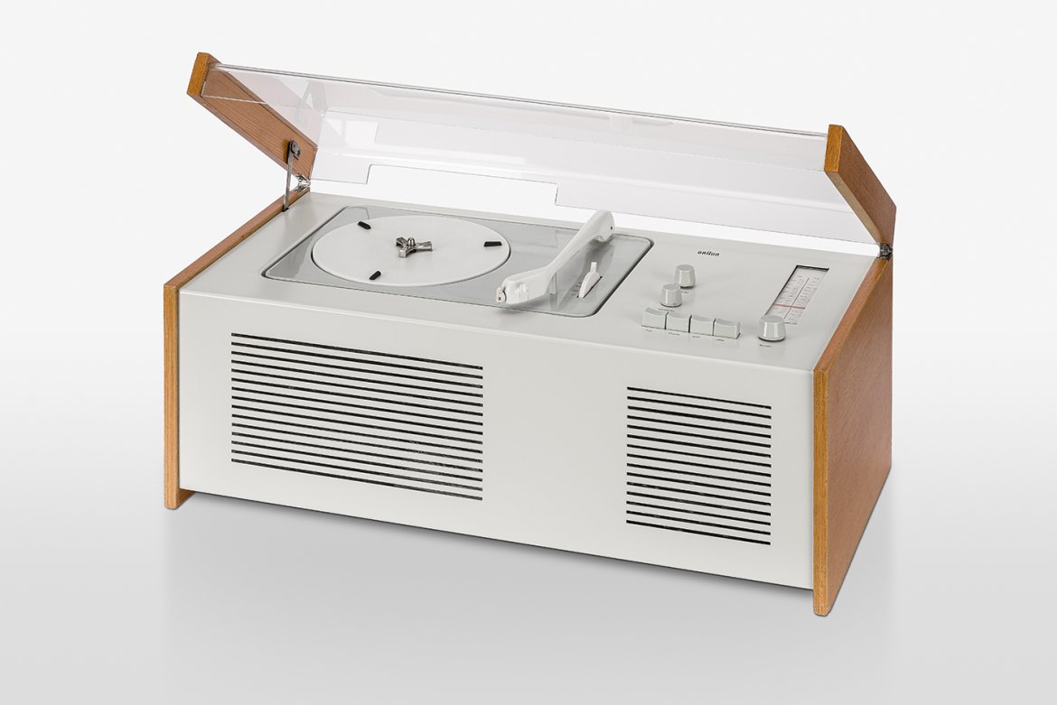
Image Notes
Demo images use Wikimedia Commons sources for Dieter Rams portrait and Braun product photography, only to simulate a real social media use case inside the design system.
Practical Demo · 4:5
O mesmo post do Dieter Rams adaptado para o formato 4:5 — layouts mais horizontais compensam o espaço vertical reduzido
A Apple não inventou essa clareza.
Ela refinou princípios que Dieter Rams já defendia há décadas.
Muito do design que hoje parece óbvio nasceu de uma ideia simples:
menos ruído, mais função.
Dieter Rams resumiu isso em uma frase:
Less, but better.
Bom design não é exagero.
Clareza.
Utilidade.
Consistência.
Intenção.
É por isso que esse tipo de design continua atual.
E é por isso que nós acreditamos nesses princípios.
Adaptation Notes · 4:5
O formato 4:5 tem menos altura disponível que o 9:16 — a adaptação compensa com layouts side-by-side nas páginas 2, 3 e 4, gap reduzido (gap-5 vs gap-8) e padding vertical menor. O conteúdo e a identidade visual permanecem os mesmos.
Composition Rules
Use these rules to create new social templates without breaking the foundation
What Must Stay Consistent
- The post preview always starts with a white page canvas.
- Inside the page, the main section always uses the system light gray and 10px radius.
- Content can live directly in the section or inside cards.
- Internal cards stay neutral gray 50, white stroke, zero radius, and 45px padding.
Recommended Use Cases
- Case study excerpts and launch storytelling.
- Process explanations and framework breakdowns.
- Short educational content for product and design audiences.
- Repeatable mobile-first content systems for campaigns.
<div className="bg-white p-4">
  <div className="rounded-[10px] bg-[#efefef] p-4">
    {/* direct content */}

    <div className="rounded-none border border-white bg-[#f9f9f9] p-[var(--card-padding)]">
      {/* optional internal card */}
    </div>
  </div>
</div>